Brief Interpretation
Translate a lightweight product brief into a clear visual premise, audience direction, and presentation hierarchy.
VISUAL SYSTEM STUDY · CRYPTO BRAND DESIGN
Crypto Landing Page & Extended Brand System
A 99designs landing-page response expanded through a self-initiated study into a broader crypto and Web3 visual system.
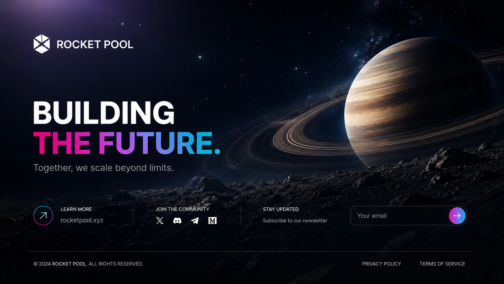
Project classification: Competition Entry. Commercial proof: Capability Proof.
This project began with a 99designs brief for one cryptocurrency landing page. I used that limited scope as the foundation for a broader visual-system study spanning responsive website presentations, launch graphics, roadmap communication, event collateral, posters, and brand guidelines.
The work explores how a playful, community-led Web3 concept can retain its personality while gaining enough structure and consistency to support a wider visual world.
The original ask was a new cryptocurrency landing page for an audience that skewed toward Gen Z and Millennials. The direction needed to feel fun, community-driven, and connected to a space theme, with Saturn and mission language providing the central creative cues.
The competition requested one web page. The additional mockups and brand applications shown later in this case study were developed independently after that initial response.
The core tension was balancing meme-coin energy with visual discipline. The concept needed enough personality and social appeal to feel community-led, but it also required clear hierarchy, readable information, and a consistent structure.
The solution treats playfulness and credibility as parts of the same system. Expressive imagery creates attention, while typography, spacing, and modular layouts keep the product story understandable.
I built the direction around deep-space compositions, Saturn imagery, bright accent streaks, bold sans-serif typography, and mascot-led storytelling. Those elements create an immediately recognizable atmosphere without replacing the practical work of organizing the page.
The same visual rules were then applied across different formats. Scale, framing, and information density change by application, while the palette, imagery, typography, and mission narrative remain consistent.
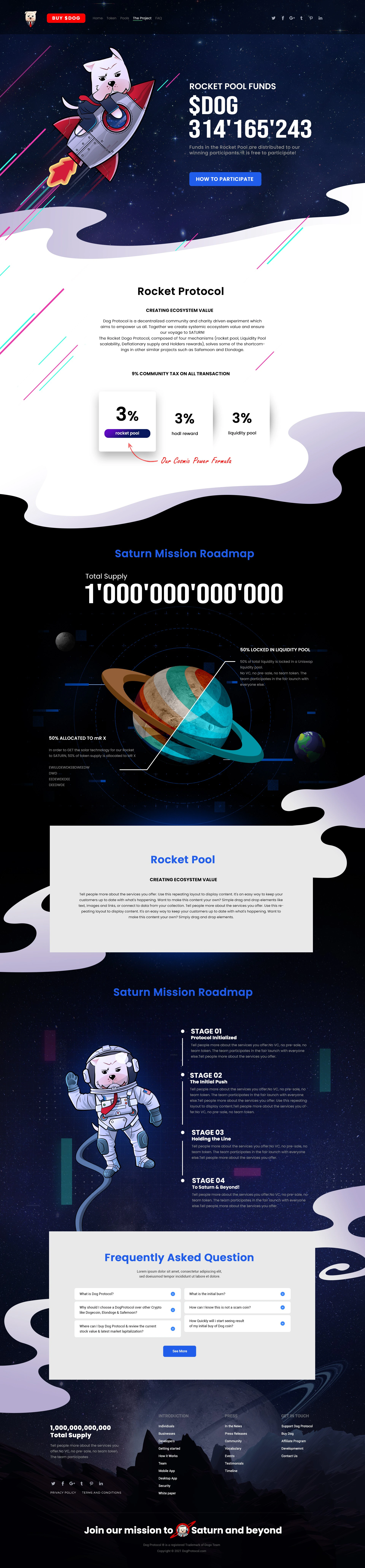
The landing-page direction was organized as one continuous story, then presented across long-scroll, desktop, and mobile contexts without changing the underlying visual language.
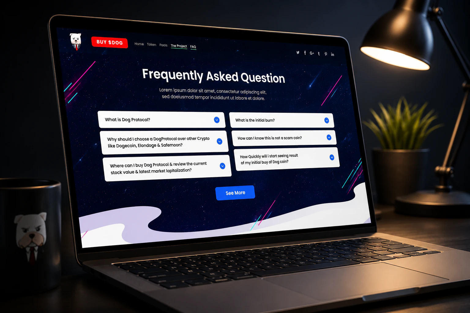
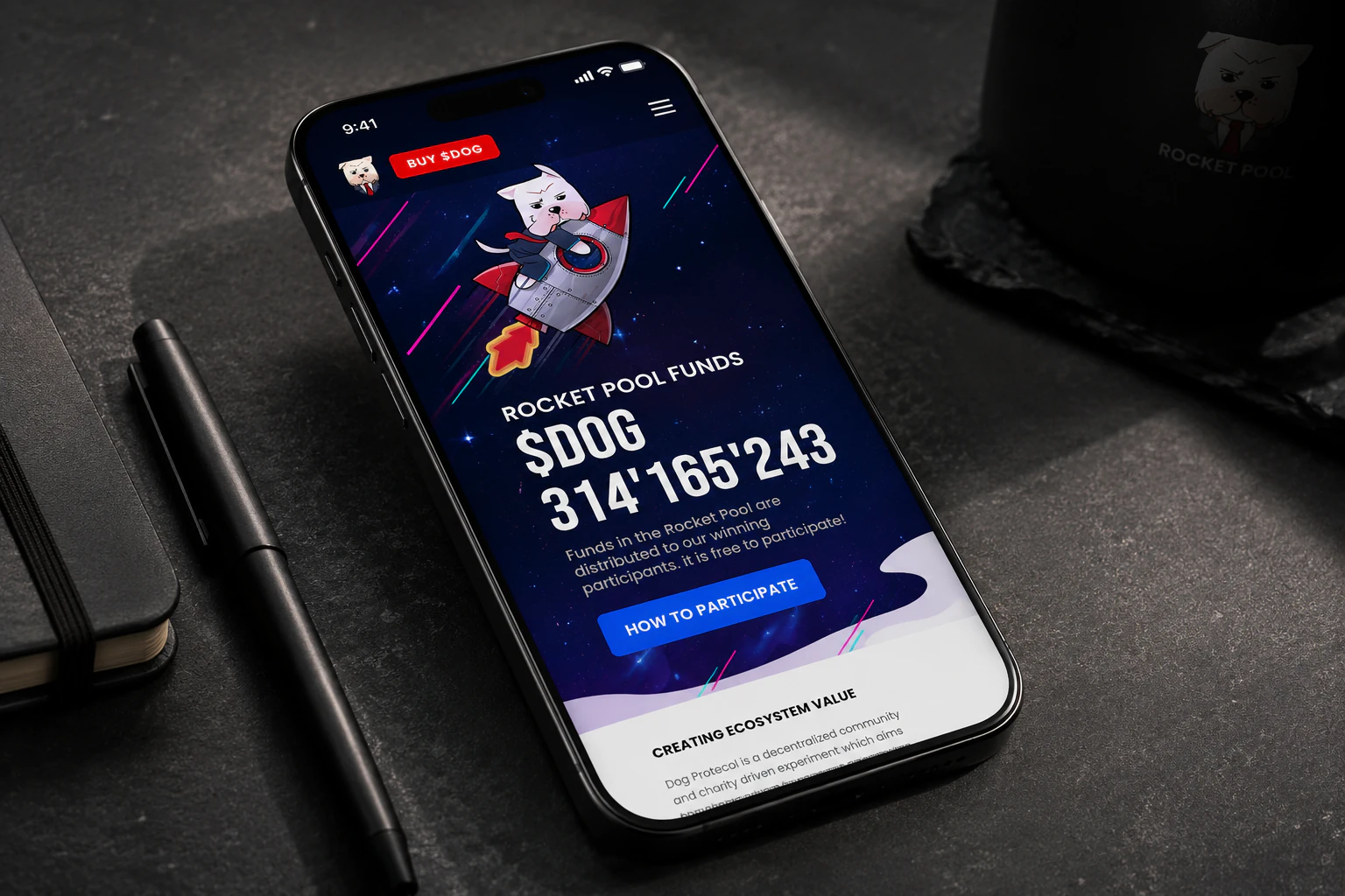
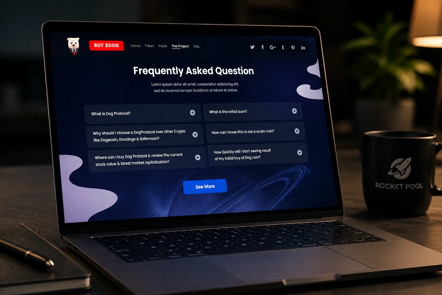
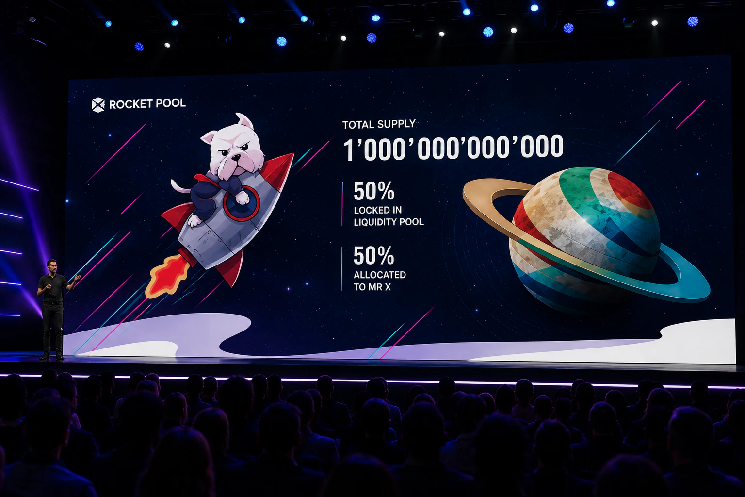
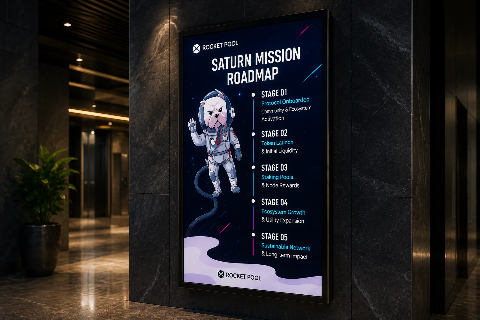
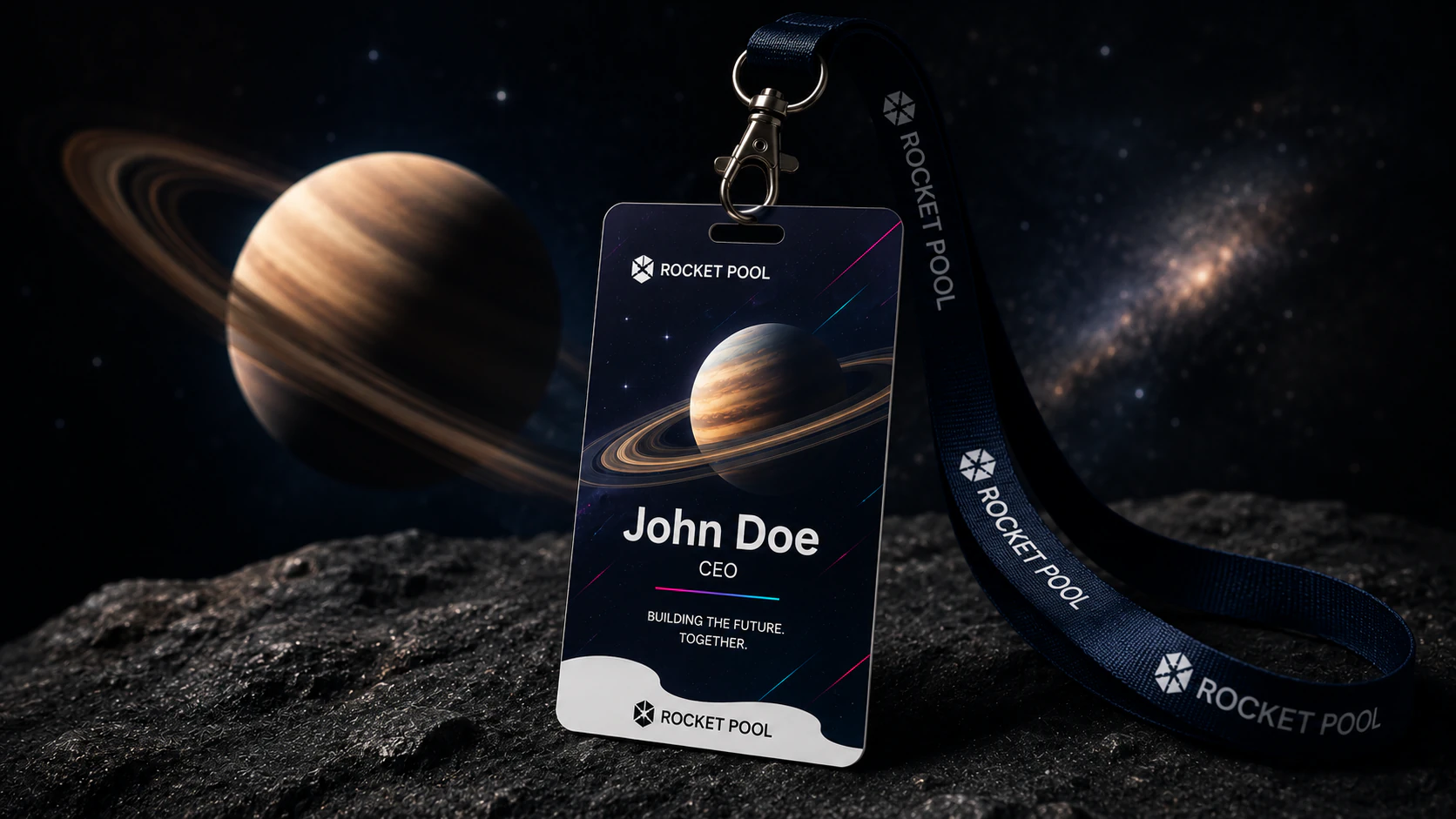
The self-initiated extension tests how the landing-page language could carry into presentation screens, roadmap communication, event identity, and public-facing poster applications.
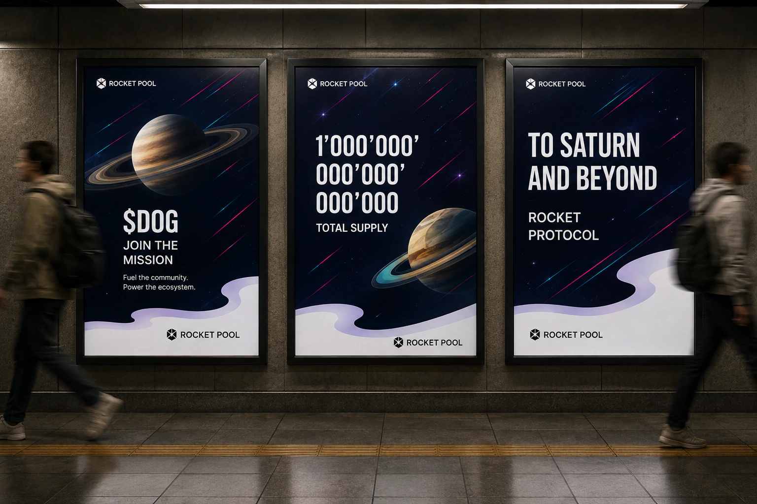
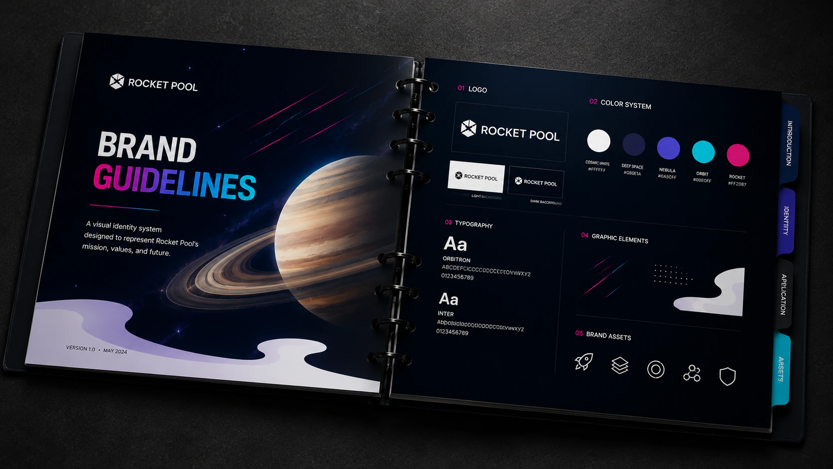
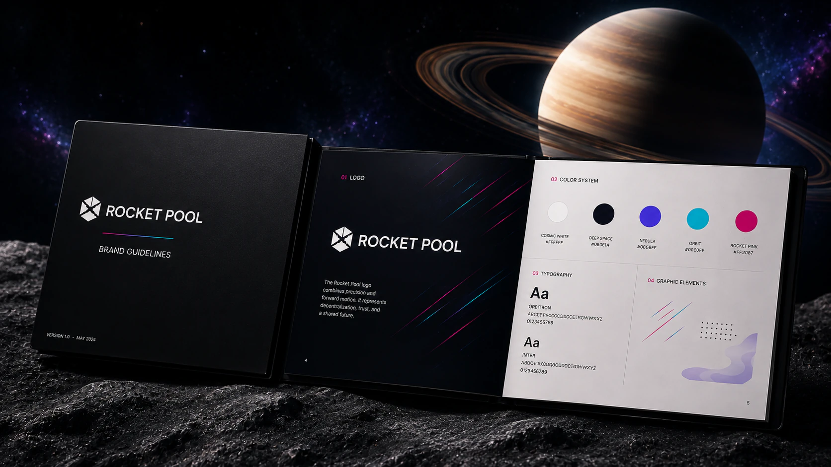
Two self-initiated guideline mockups organize the core identity ingredients and show how the visual direction could be documented as a repeatable system.
Translate a lightweight product brief into a clear visual premise, audience direction, and presentation hierarchy.
Shape a responsive one-page experience around product storytelling, community energy, and readable content structure.
Extend a core visual language across identity, typography, color, imagery, layout, and documented applications.
Adapt the system into roadmap graphics, conference visuals, posters, event collateral, and pitch-ready brand materials.
One completed landing-page concept, responsive website presentations, and a self-initiated set of launch, event, poster, and brand-guideline applications developed as a visual-system proof piece.
The finished proof piece demonstrates how one focused web-design brief can become a coherent visual language across responsive screens, presentation environments, campaign-style graphics, event materials, and identity documentation.
Share the product idea, audience, and current materials. I can help define the visual system and the clearest set of applications to develop next.