B2B FINTECH PROPOSAL DEVELOPMENT
Crypto Trading Visual Identity & Brand System
A fintech visual system built around precision, signal, execution, and clarity.
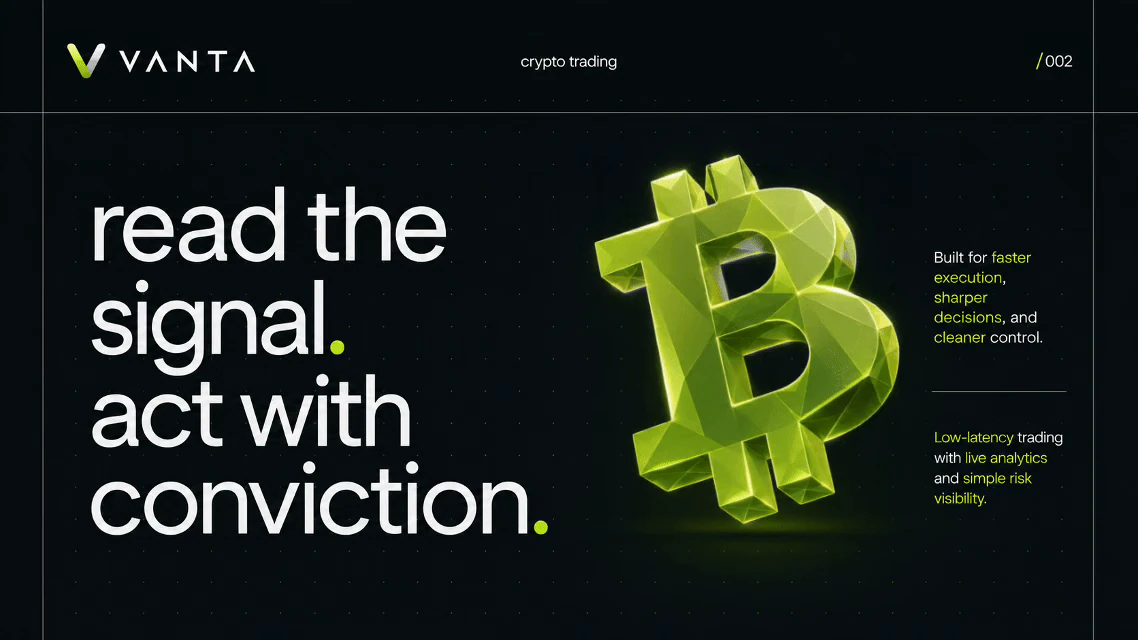
Project classification: Proposal Stage Concept. Commercial proof: Proposal Proof.
- Project Type
- B2B Fintech Proposal and Visual System
- Context
- Client Proposal and Concept Development
- Role
- Creative Direction, Art Direction, Visual Identity, and 3D Visual Development
- Focus
- Fintech, Crypto, Data Visualization, and Product Visuals
- System
- Identity, Presentation, Product, 3D, and Motion
- Year
- 2026
I developed a complete visual system for a client's crypto trading proposal, covering the identity, visual direction, presentation language, and early product and terminal concepts.
The aim was to create a financial technology identity that feels credible and modern without relying on familiar crypto visual clichés. The direction combines restrained editorial layouts, strong typography, dark and light modes, a sharp lime accent, structured data presentation, and dimensional 3D symbols.
This work was developed for a B2B proposal. It gives decision-makers a coherent visual reference for evaluating the brand, platform idea, and product direction.
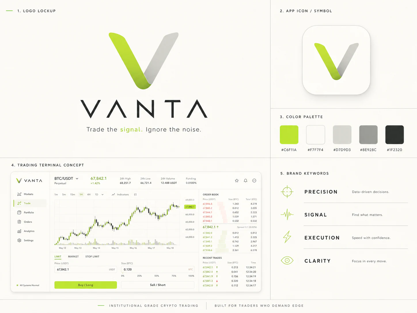
Four principles shape the system: precision, signal, execution, and clarity. They guide everything from typography and data hierarchy to iconography, dimensional objects, and interface concepts.
- Precision
- Data-driven decisions.
- Signal
- Find what matters.
- Execution
- Speed with confidence.
- Clarity
- Focus in every move.
The wordmark, app symbol, lime accent, typographic hierarchy, and dimensional symbol language create an identity that can shift between light and dark environments without losing recognition.
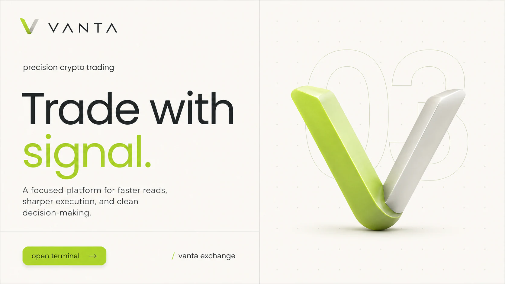
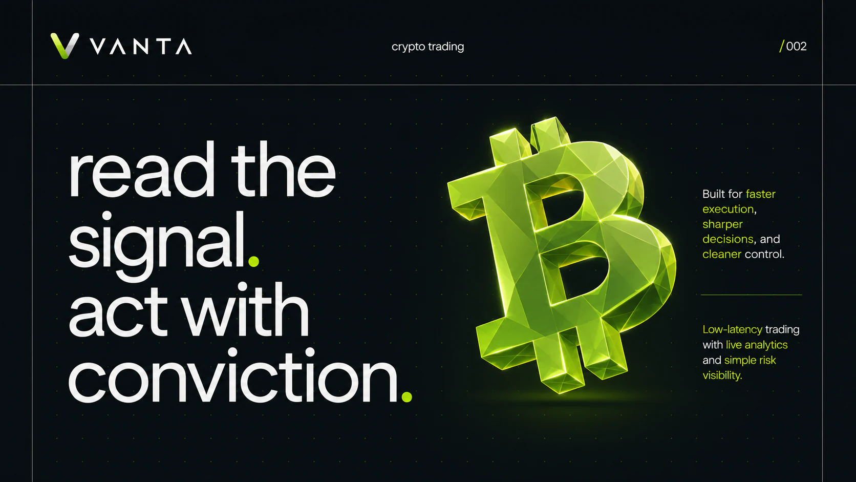
The direction connects the wordmark, app symbol, color palette, typography, brand principles, terminal concept, financial graphics, 3D objects, and editorial layouts inside one framework.
Light and dark presentation modes use scale, spacing, fine rules, and controlled lime accents to organize platform narratives, market context, capabilities, and people-profile content.
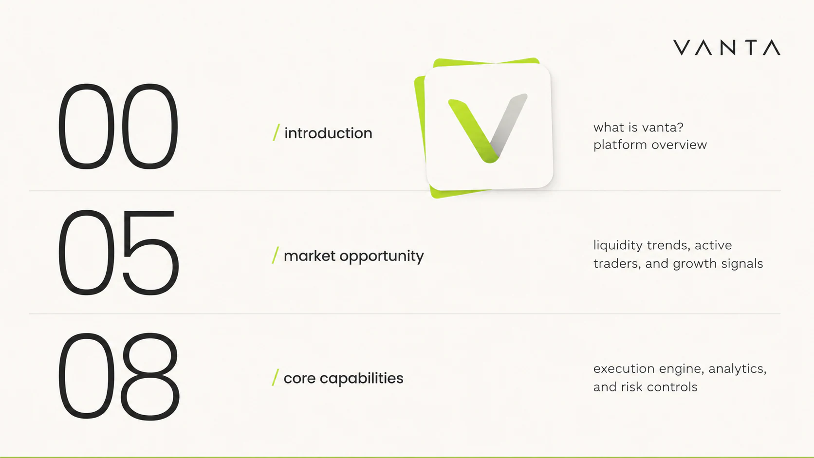
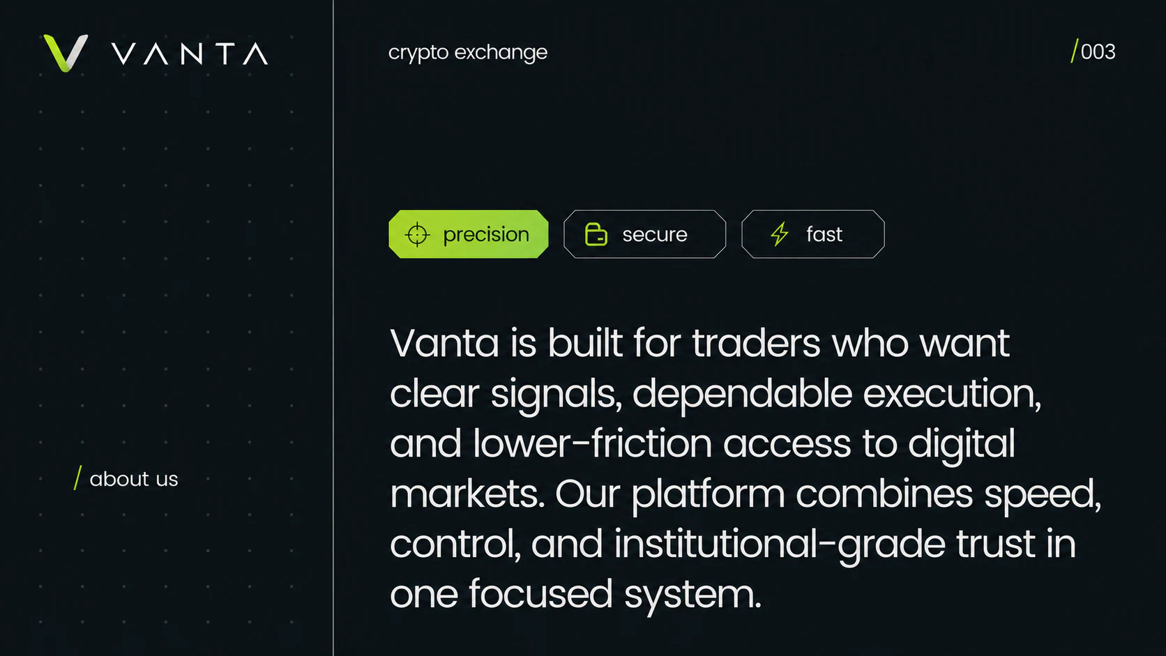
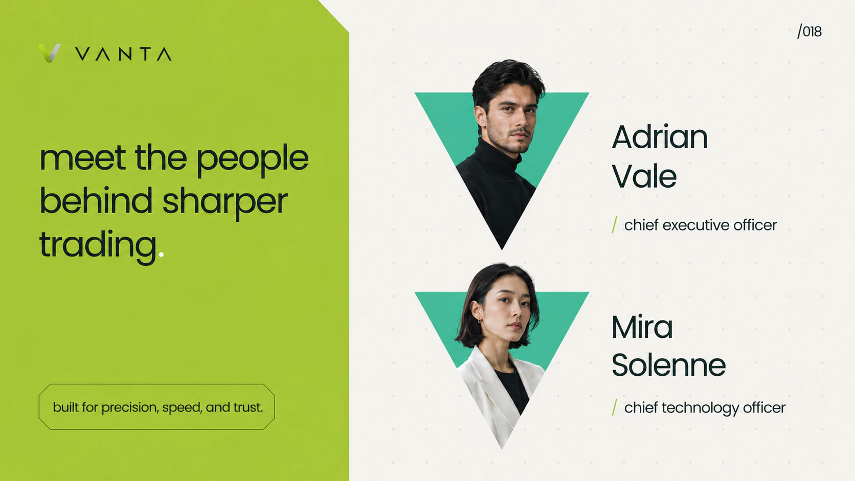
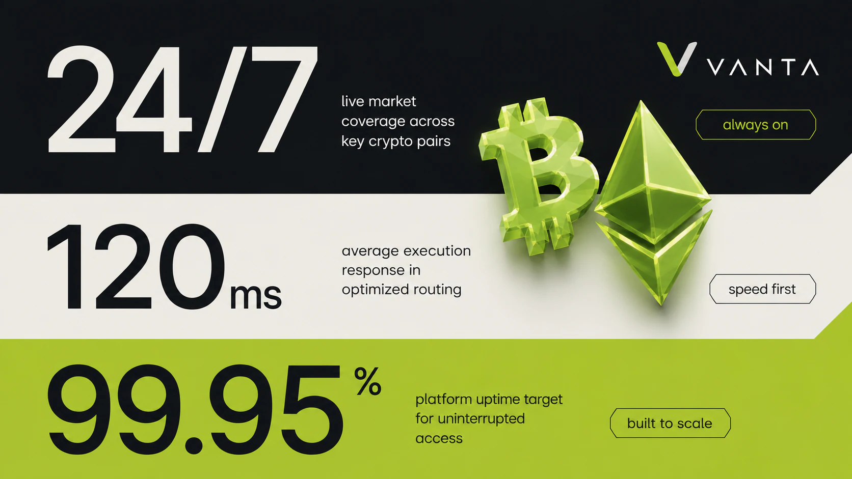
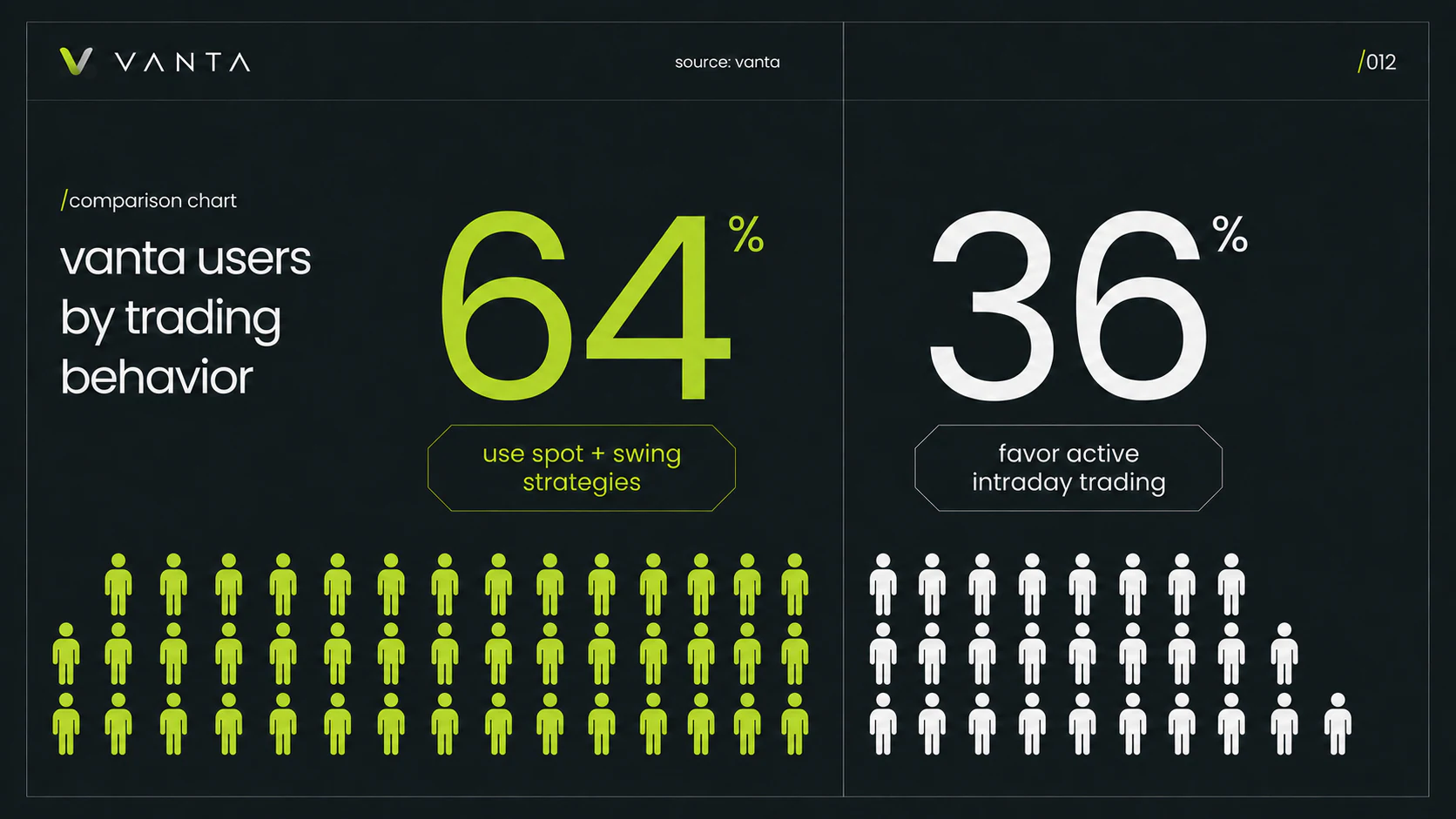
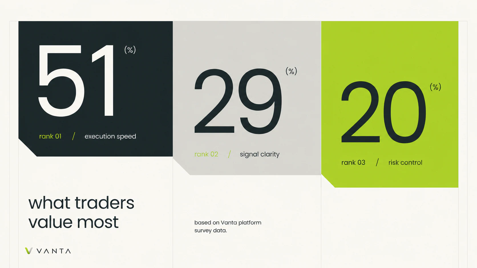
The data-led boards explore how a trading identity could organize market coverage, latency, uptime, user behavior, and trader priorities. Every figure is illustrative design content, not a verified company metric.
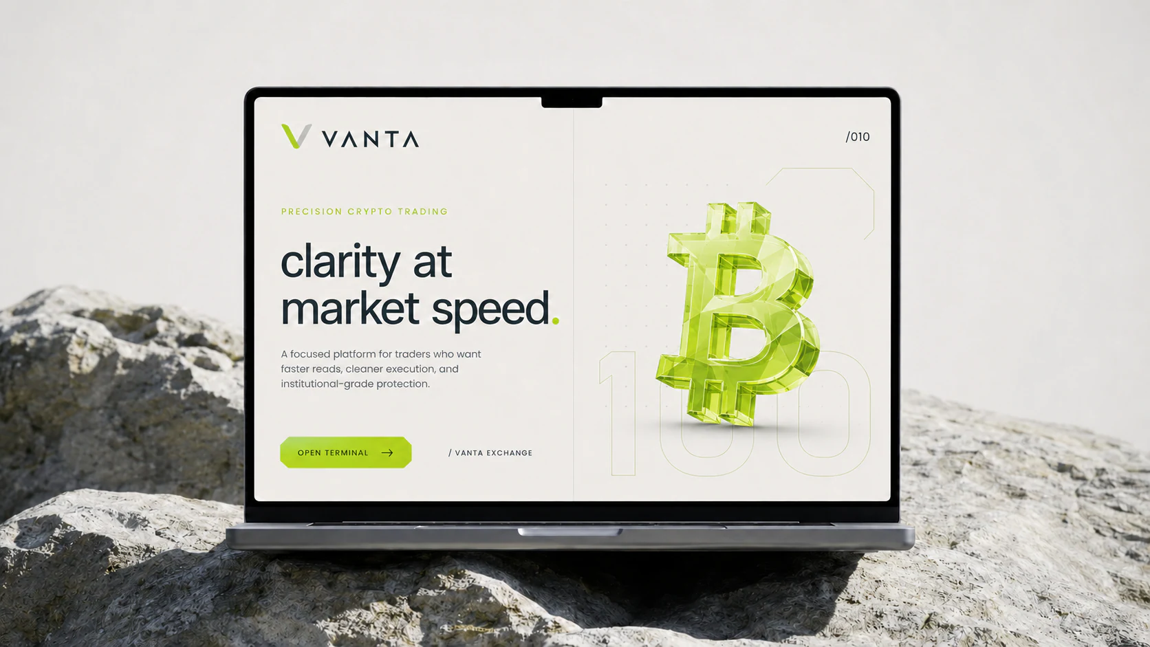
The laptop composition and terminal study show how the identity extends into a product-facing environment and supports the client proposal.
The workflow combines generative visual exploration, graphic design, dimensional development, compositing, and motion. The objective was not to create isolated images, but to make every expression feel connected.
- Creative Direction
- Visual Identity and Layout
- Generative Visual Exploration
- 3D-Style Visual Development
- Compositing
- Motion Exploration
The result is a flexible visual language that can move from identity to trading interfaces, presentation decks, financial graphics, campaign imagery, and motion while keeping one clear point of view.
The project shows how I approach visual systems as connected design languages rather than isolated pieces of artwork.
I can help shape the identity, presentation language, product visuals, 3D direction, and motion system into one coherent creative framework.